
Mobile phones are a big thing. People communicate, shop, learn and pay using their smartphones. They are more portable than laptops, having the same or better functionality. Besides, the fact that nowadays people prefer to order everything online has shown how big is the priority towards establishing a solid web presence. Your website should be relevant and timely to attract visitors and increase conversion. Besides, it should have a decent loading speed, be SEO optimized, and perfectly displayed on all kinds of devices.
Search engines have also identified the constantly growing mobile traffic and the evolving need for an optimized user experience. Hence, they have started adjusting their ways of ranking websites. On another note, tech enterprises keep releasing devices with different screen sizes, forcing companies to adjust their websites to keep up with such diversity.
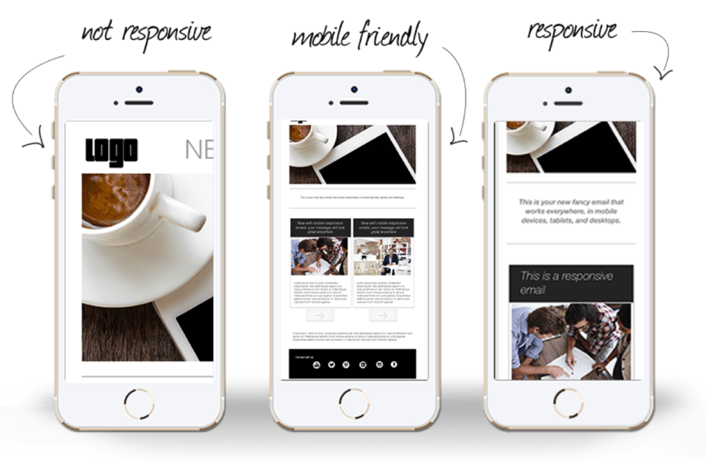
Responsive design is a crucial part when it comes to controlling how the website looks on different devices. While some sites can be mobile–friendly, it might still be not enough to make all the information look clear and flawless.
Let’s find out more about responsive design, its importance and role in SEO, and how to upgrade your website to be responsive.
The Definition of Responsive Design
Responsive design is a design that has the ability to adapt to different device screens and their sizes. The site servers are sharing its HTML code across all devices while CCS alters the site’s design to ensure it looks relevant on certain screen sizes. All the pictures, text, and other graphical elements automatically adapt with each component looking reader–friendly and clear.
Responsive design makes each website element accessible from whatever device users open it. While the mobile–friendly design might still have certain parts unclear and will require people to zoom in for further clarity, responsive design adjusts the sizing and makes sure each text is legible, each image is downloaded and every icon is clickable and visible.
The Importance of Responsive Design
Apart from looking good and being reader-friendly, responsive design has a number of other advantages worth mentioning.
Responsive Design is important for SEO Ranking
As more people browse from their smartphones rather than laptops, search engines have also recognized these tendencies, understanding the necessity of a decent mobile experience. Google’s indexing is now mobile–friendly, meaning that it prioritizes the content presented in the mobile version over the desktop one. If a mobile version has a poor loading speed with the overall design looking inappropriate and not fitting the device size, it will affect customer experience and negatively influence your SEO ranking. It might result in your website being buried in result pages and hidden from potential customers.
While responsive design is already paramount, there are more changes to cause its necessity in the near future. Google is planning to launch a new update for its ranking services in 2021 and is already setting certain expectations towards webmasters. Core Web Vitals will be mainly focused on the customer experience they get online and will set strict requirements for existing and future websites to be user– and mobile–friendly. Companies will have to adjust and adapt their websites in order to survive the competition.
Responsive Design is a Long–term investment
When you utilize responsive design, you are saving yourself time on future changes. As tech companies are producing more and more new devices with different screen sizes, it is crucial to be ready to adapt on time and make sure your customers do not lose on flawless user experience.
Responsive Design increases Conversions
Responsive design helps you to make sure that website visitors will not miss out on important information. Whenever you want them to submit a form, subscribe to a newsletter, complete a purchase, or educate themselves with your useful guide, the placement of each website element is essential for conversions. Regardless of your purpose, the overall quality experience should be always your priority. When an image is unclear, the text is hardly legible, or the design looks unadapted, visitors‘ first impression will be ruined. If there is no CTA button or it is misplaced, the conversion rate will drop. You need to ensure that people who see your website from their laptops will have the same experience with it when they browse it on their smartphones.
Responsive Design Features
Now that you know more about responsive design and how it might influence your business in the long run, it is just the time to review important elements to consider before you get started with making your site responsive.
Choose a Flexible Grid
Responsive websites are created on flexible grids, meaning that you will not need to cover all the device sizes and create a separate pixel layout for each of them. With such a large number of different devices with various sizes and resolutions, it will be impossible to build so many layouts. Besides, not all people have a maximized browser window on their laptops. Here’s where a flexible grid is of great help. Adding a breakpoint and changing the design whenever the content does not fit well are the only things needed. For instance, when the line length is too long to be read as the screen size is getting bigger, or when a box gets squeezed with 2 words on every line when the screen narrows.
Consider Touchscreens
Nowadays there are touchscreens even in laptops making it necessary to design websites for those using a mouse and people who prefer touchscreens. For example, if there is a form with a drop–down menu on the desktop website view, consider making it bigger for mobile devices to be easily pressed. Things like buttons may not be accessible enough on smartphones, so they should be implemented and displayed properly.
Decide on the Elements
Responsive design doesn’t always call for website replication. You are looking to provide a great experience for your visitors, and leaving some elements out might be a necessity to make your website look great on smaller devices.
Websites using responsive design will most likely condense some elements, like menu and navigation, into a button to let users open it with a single click. While the site menu, as a rule, is expanded when designed for larger screens, there is no harm in placing it behind the button when creating a mobile version. You can as well set certain rules for either including website elements or leaving them out by modifying the site’s codes, like CSS.
Think of the Images
As the mobile version should be as bright and colorful as the desktop one, having all the images in place, you need to create rules in the CSS code that will determine how all the images will be treated when displayed on different screens. Images can be left in their full width, removed, or customized according to certain screen resolutions. Make sure to invest some time into setting the rules to avoid broken, wrongly cropped, or unclear images.
Check Pre–designed Themes
Themes and layouts that are pre–designed and ready–to–use are of great help when there is no time or resources to design a responsive website from scratch. A few things left to do is adjust the style to match the company’s branding, choose the right colors, and place your content.
Wrapping Up
Responsive design is an app or website design able to adapt to those device screens where the web page is opened. It is vital for flawless user experience and a professional look of your website both on the laptop and mobile devices. Nowadays, no one wants to scroll sideways to find things or zoom in unclear parts whenever they open a website from a smartphone. Everyone is expecting modern websites to be built responsively and display well on various screen sizes.
Responsive design is fairly easy to implement and is a long–term investment. As large enterprises release upgraded devices, each with unique and varied screen sizes, you need to prepare your website for such innovations. Responsive design helps you keep up with the SEO rankings, increase conversions, retain clients, and attract new ones.